CS3216: Assignment 2 Application Critique
05 Sep 2017 | CS3216 Web Application
There are several take-aways from Flowx that I can apply for my own app development:
1. “Free Users vs Primium Users” nailed it
It’s every application’s dilema that they have to charge the users somehow to generate revenue. The main problem is, app users generally have a low tolerance towards payments; they rather go for sligtly inferior free solution rather than paying for premium service. Flowx actually has Free Users and Premium Users distinction, and they provide different level of utilities to each group. What I found laudable of Flowx’s pricing policy is that they managed to separate the user experience by payment, while also satisfying both groups to a certain extent. To free users, Flowx provides basic features such as realtime rain condition and wind condition, which is just enough utilities for average users whose purpose for using the app is mainly to check the daily weather condition. On the other hand, Flowx provides over 30 types of data features to premium users, fulfilling the needs for Power users who want those meteorological data for more professional purpose. In the end, free users end up satisfied with the service because that’s exactly what they are needed, and premium users also end up satisfied because they will get the utilities they want which are not opened to Free users.
2. Too much UI, but too bad
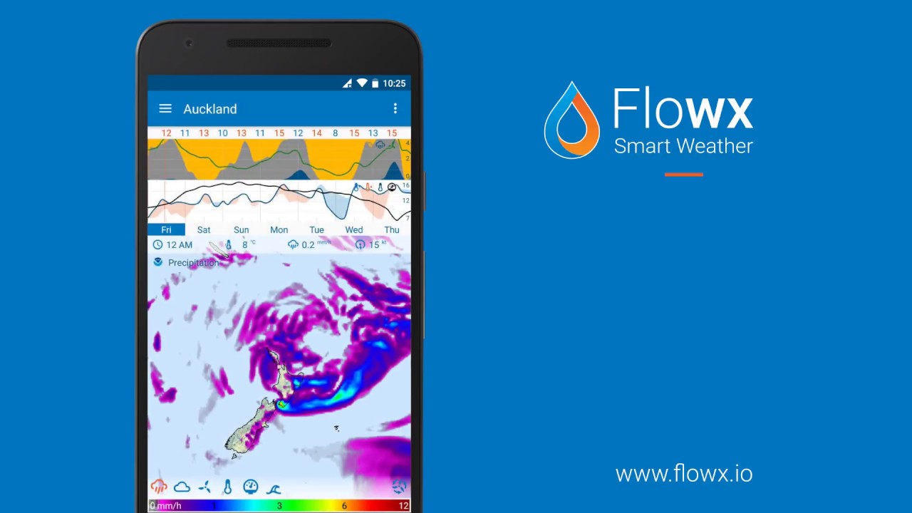
By its nature as a meteorological app, Flowx has to display a lot of information on the screen simultaneously. They tried their best to make UI recognizable, but still some of the fonts and images are too small to recognize because everything, including the giant map, has to be crammed into small smartphone screen. Probably, this is the reason that it is relatively harder to find meteorological in mobile compared to desktop environment, because meteorological data inheritably requires a large screen size to be displayed properly. This taught be that when choosing the idea for mobile app, it is important to realize potential inherited limitations of developing in mobile environment, and if the limitations are too much, I might have to pivot to another idea instead.
3. Singapore is too small for this
One thing that the presenter pointed out was that even in the maximum zoom, Singapore is too small in map to be able to provide meaningful weather data to Singaporean users. This point is important because when an app’s target audience is in the global scale, a feature might work in one region but not so much in another due to various limitations. Flowx might have lost significant number of Singaporean users due to their map resolution limitation, and potentially other reasons that weather data in microscopic scale matters. Hence, when designing an application, the developer has to take into consideration of different conditions in different markets, and adapt to the market condition as much as possible.
My Thoughts
While the idea of meteorological app is definitely cool and the UI & UX are done decently, but I believe there are some innate limitations of this application, especially in terms of generating revenue. During the presentation, the group proposed potential business ideas targeting restaurants and outdoor activities, but basic weather data such as rain activity is also available to Free users. If Flowx makes rain activity as a premium feature, they are going to lose huge number of Free users so it is not a smart move. In terms of providing advanced meteorological data to Power users, there are no significant reason that it has to come with mobility. Since desktop application provides much better experience than mobile application for the same concept, Power users are much more likely to use desktop app instead. Hence, while the app managed to attract large user pool with their cool idea and design, but I foresee limited business opportunities from their app.